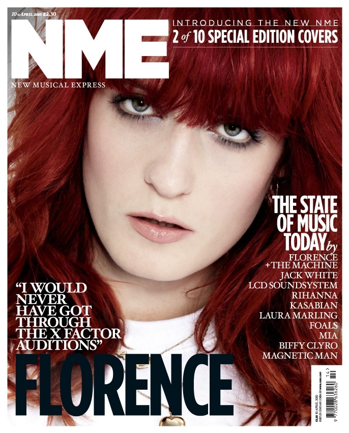
 To help me decide how to layout my front cover I looked at a previous NME cover too help me. The cover is very 'clean cut' and professional. I imagine that the target audience is a lot older than my own. For this reason I decided to add more stories and images, so it's similar to the Smash Hits one from before. However, I would use more alternative artists and give it a grungier feel. I would also use different fonts because the NME one's give a very corporate feel to the magazine, however, I would use a similar type of artist and image because it would attract my audience. I could also incorporate some of the themes in the magazine to my own, for example, the bar code, price and date. Here is an example of how I will layout my front cover. I decided to use banners and shapes because it can attract audiences.
I would also use a grungier theme then the one shown in NME, but i would mainly focus on one image. I would include more features on the cover too, because younger audiences may find this more attractive.
No comments:
Post a Comment